[Case Study 03]
Enhancing User Trust with an Order Confirmation Page
B2B e‑commerce

25% Drop in Support Queries: Better Order Confirmation, Higher Trust
Redesigning the page to boost clarity, ease anxiety, and reduce support calls.
[Project Overview]
Faced with a 40% cart abandonment rate, I redesigned the checkout flow to address user pain points by simplifying the process, optimising for mobile, and adding features like autofill and error validation.
[Problem Statement]
The original confirmation page had a confusing layout, lacked vital order information, and left users uncertain about their purchase status, causing frustration and avoidable support queries.
[Industry]
B2B e‑commerce
[My Role]
Product Designer
[Platforms]
Android
[Timeline]
1 month
[Persona]

Suresh Kumar
Kirana Store Owner
I want to restock his kirana shop confidently without order confusion.
Age: 42
Location: Coimbatore, Tamil Nadu
Tech Proficiency: Low
Gender: Male
[Goal]
Place accurate bulk orders quickly for daily essentials.
Get clear, instant confirmation with delivery details.
Avoid unnecessary calls to customer support.
[Frustations]
Wasted time calling support affects his shop routine.
Error messages that don’t explain the issue.
Confusing confirmation page makes him doubt what he ordered.
[Process]
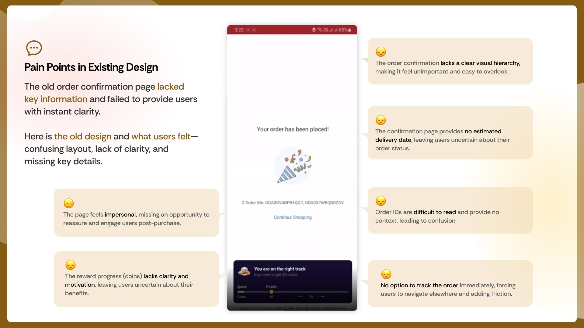
[01] Pain Points in Existing Design
Too basic: Only showed “Order Placed”, confetti, and an order ID.
No item summary: Users couldn’t see what they actually ordered.
No delivery info: No clue when or how the order would arrive.
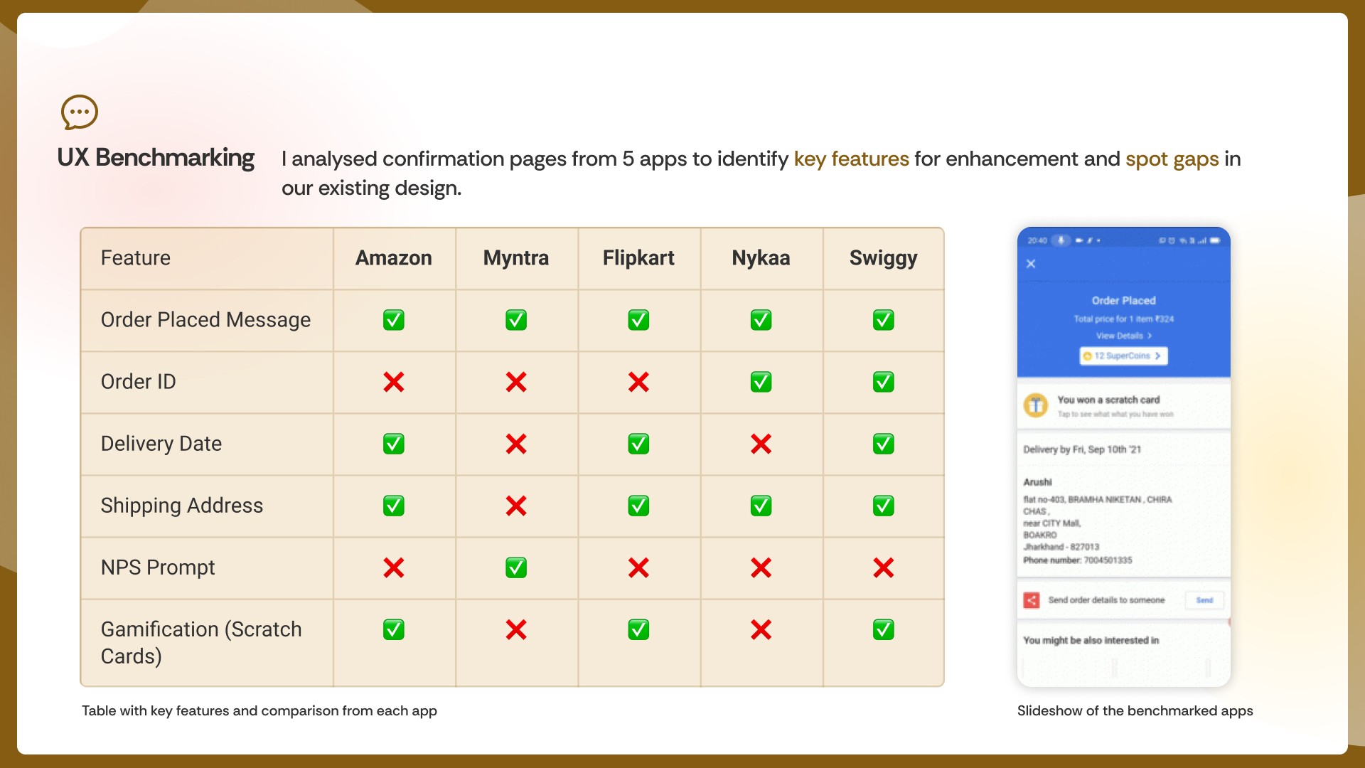
[02] UX Benchmarking
Compared 5 popular apps to identify best practices and missing features.
Noted gaps like missing delivery date and shipping info in our design.
Highlighted opportunities for engagement, like gamification and feedback prompts.
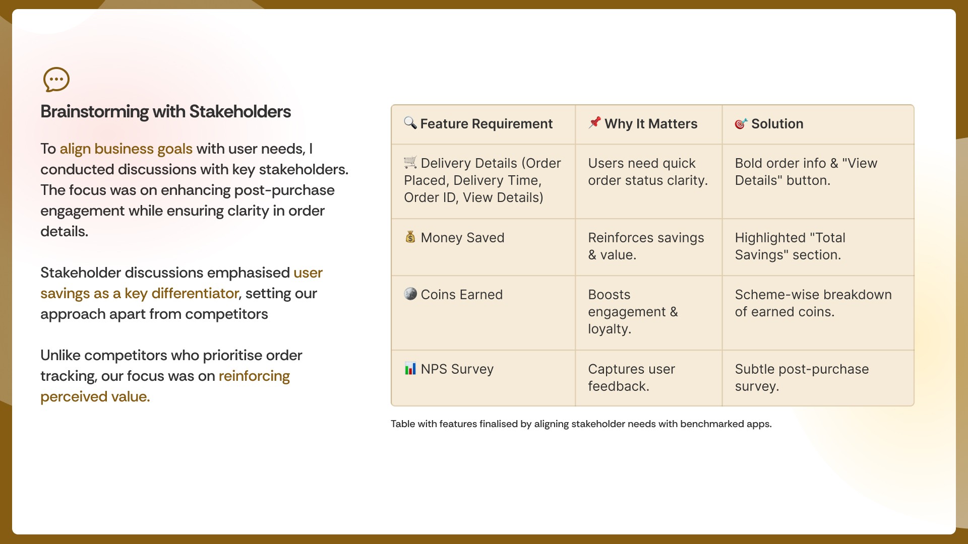
[03 Brainstorming with Stakeholders]
Held in-depth discussions to align user needs, business goals, and technical feasibility.
Identified user savings and visible benefits as a strong, unique differentiator to stand out.
Decided to highlight added value instead of focusing only on basic order tracking.
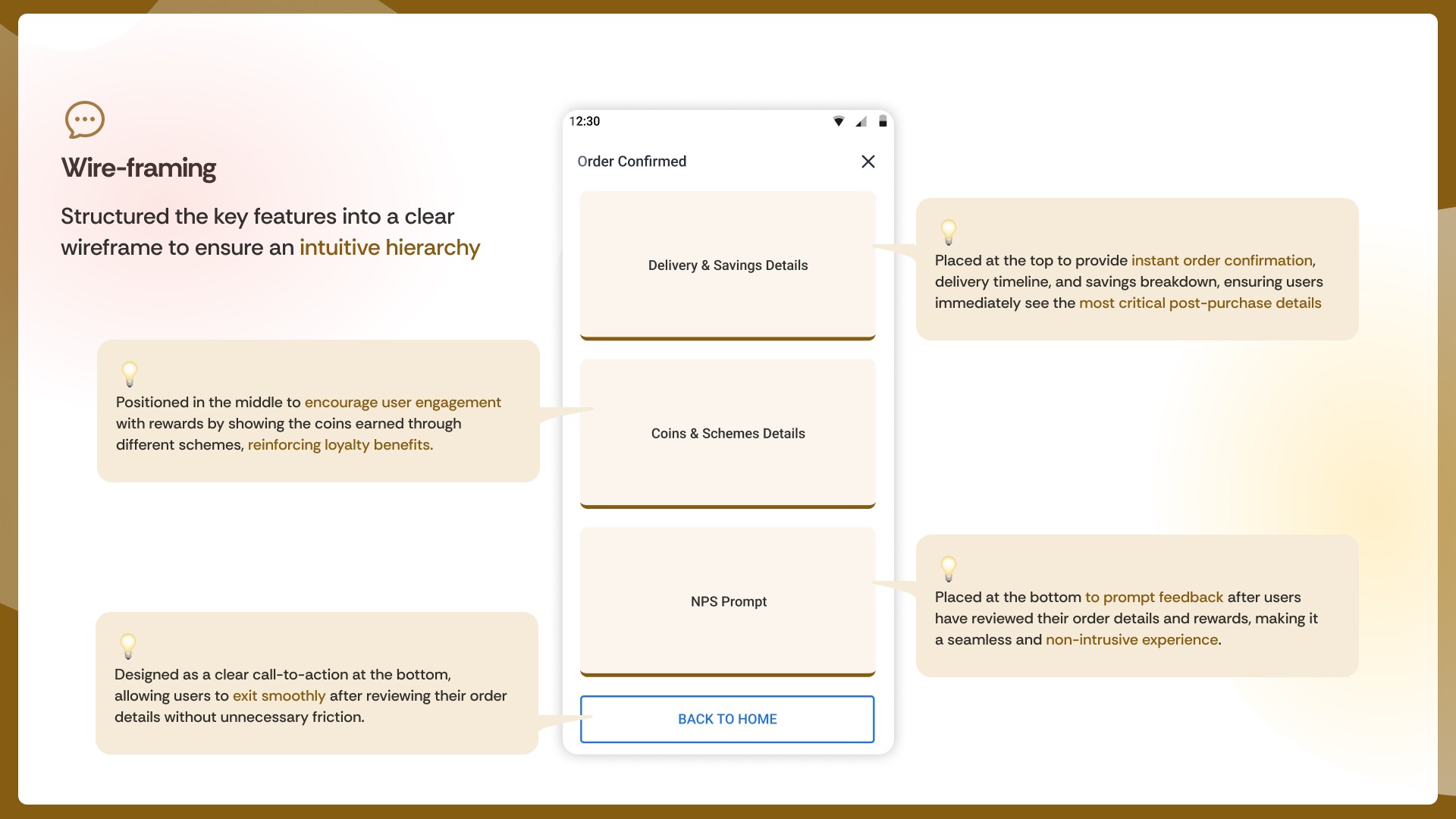
[04 Wireframing]
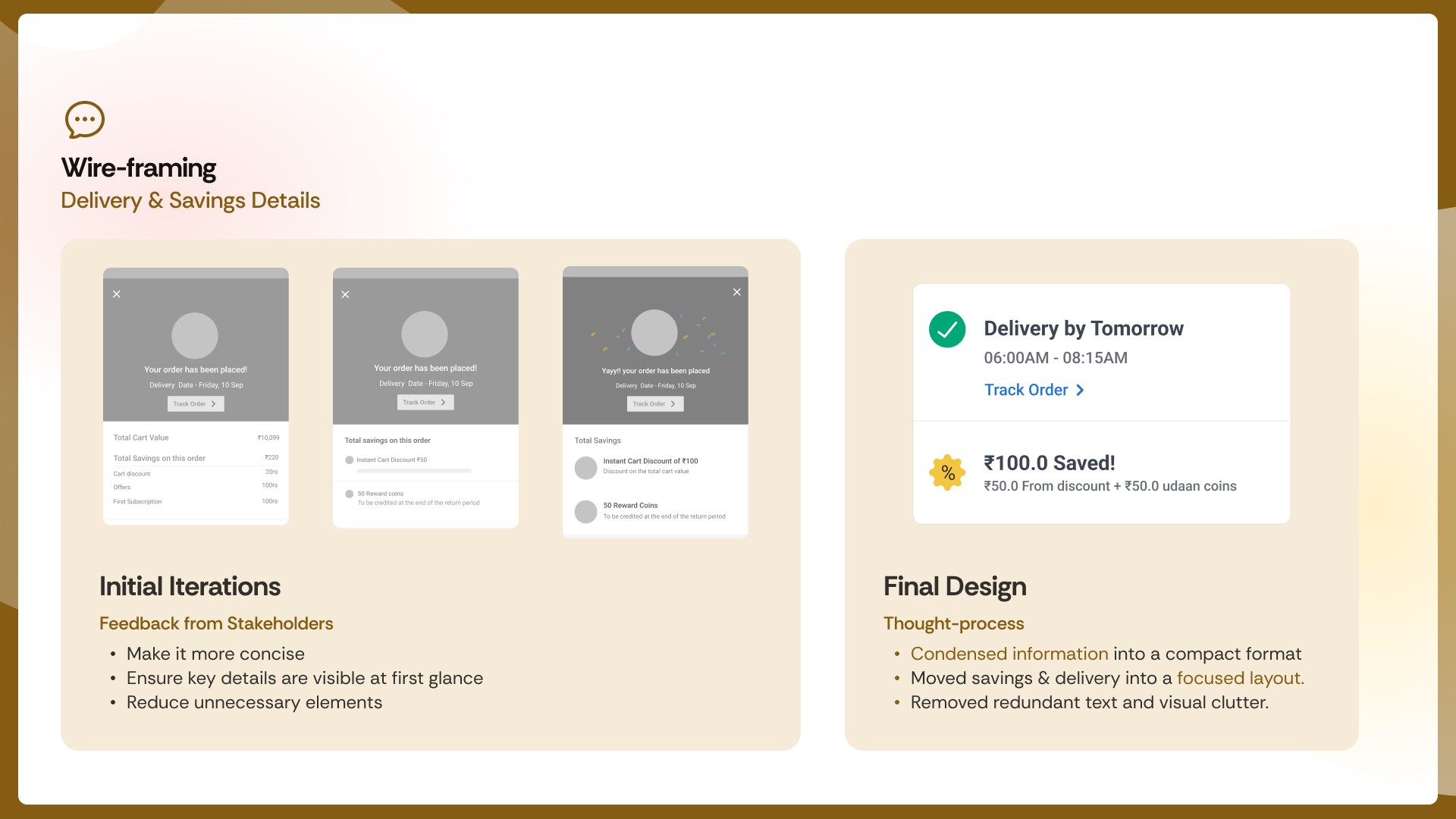
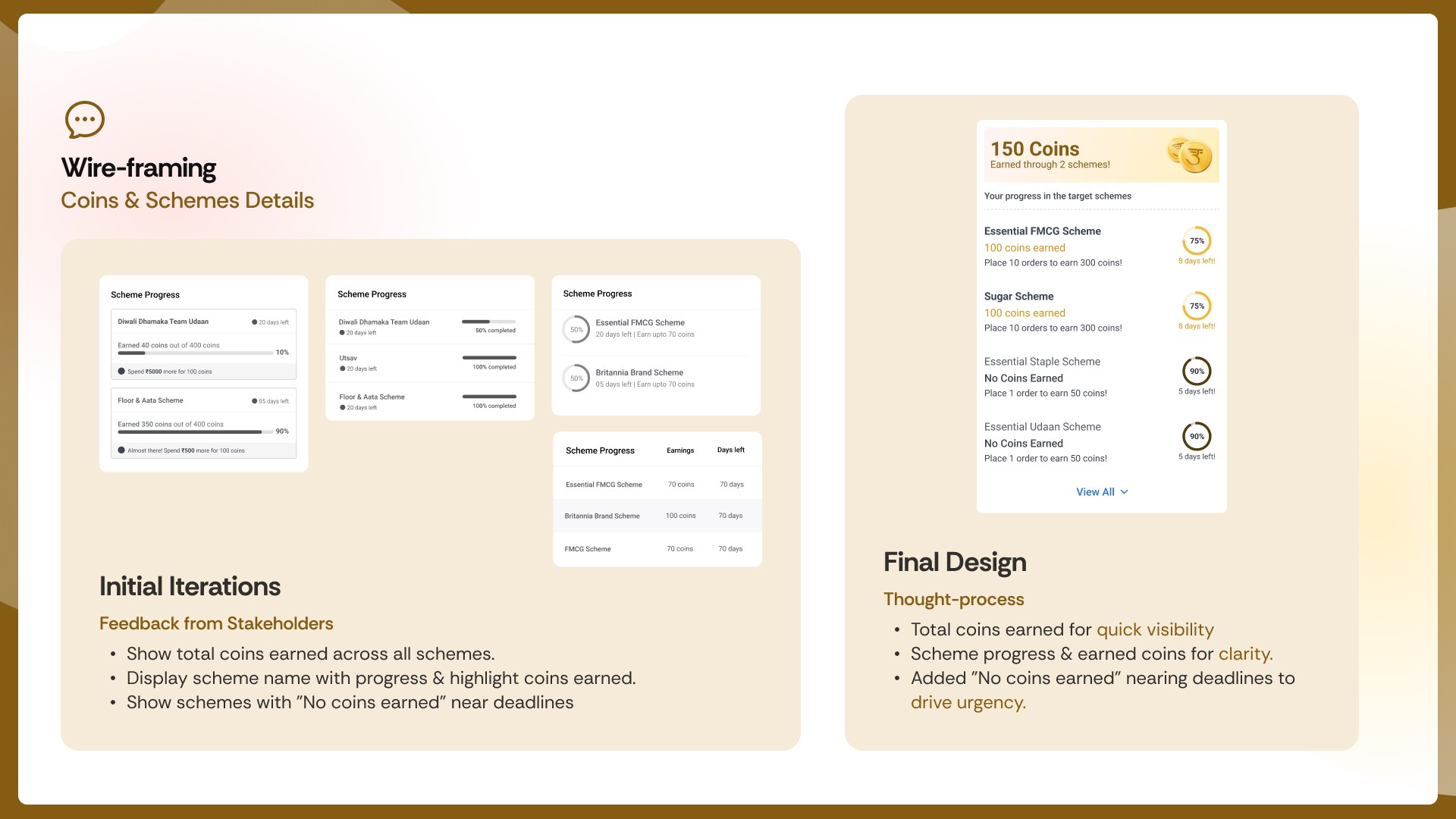
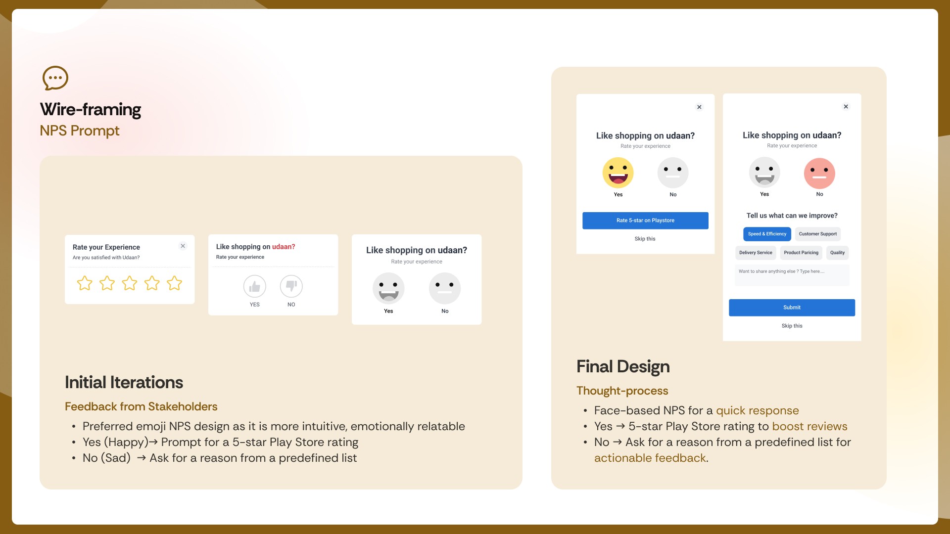
Structured key features into a clear wireframe with a logical, user-friendly hierarchy.
Divided content into three parts: delivery & savings info, points & schemes details, and NPS feedback.
Explored iterations for each section and finalized the most effective design with the team’s input.
[Outcome]
25% fewer support queries — clearer details reduced confusion.
32% more engagement — savings and coins drove interaction.
Higher trust — better clarity boosted repeat orders.
[Key Learnings]
Clarity Builds Trust:
Clear design reduces anxiety and boosts confidence.
Feedback is Gold:
Listening to users leads to meaningful solutions.
Early Wins Matter:
Creating impact early sets the tone for future work.